New campaign promotes the benefits of etrading for MGAs
'Next Stop' campaign for Go-Insur highlights the advantages of e-trading for MGAs, and the ease of adoption.
In our latest usability review of UK car insurers, we can reveal popular design practices. This covers direct insurer quote & buy journeys and was done for benchmarking service DigitalBar.

All providers aim to hook applicants into their journeys quickly. Tesco is the notable exception, perhaps ahead of the game on Consumer Duty.
The commonly used 'hook' is to ask customers for their car registration and instantly play back the car model details; this immediately personalises the experience and gives users an instant 'I've got this!' feeling, securing their commitment to the next steps of the journey.
The fashion for 'scoot along' style journeys (i.e. short pages, 1-3 questions per screen) is favoured by some high scorers in our review e.g. Hastings, Flow, but most major on or combine with a 'scroll' approach (larger numbers of questions per screen) e.g. AXA, Aviva, Asda, Diamond, Elephant, Esure, MoreThan, Sheila's Wheels, Swinton. There's no right or wrong here. It's about execution. Both can work well.
A minority in our review (Ageas, Rias) use 'progressive disclosure' (a stepped, long page scroll, where completed questions reveal additional questions)
Good UX practice is to be transparent about the number of steps in your quote & buy journey and to label the steps. The idea is to help inform and orientate the user. Many UK car insurers follow the transparency principle, but some fall short or misjudge the execution.
Good practice is to be transparent about the number of journey steps and to label the steps.
A simple journey structure, a small number of clearly labelled steps. The user is clear about what to expect.

Many others do similar versions of this with varying degrees of refinement e.g. Asda Money, AXA, Swiftcover, Elephant, Ageas.

A small number of clearly labelled steps. More understated than Admiral, more modern and refined than most.
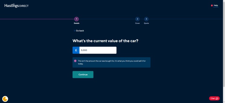
A larger number of unlabelled steps and lack of transparency. The user has no information about the journey ahead.

Similar to Direct Line but with a progress bar and even less information about the journey structure. The design intention is probably good; aiming to create a sense of ease and calm, strip away the noise, understate the task; however, the user is in the dark.
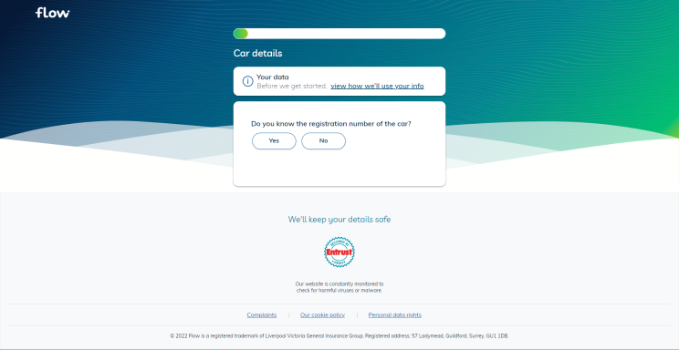
A clean design approach and numbered steps but no transparency on what will be asked.

LV= is transparent about the number of journey steps but labelling is compromised by the design structure. We suspect the labelling was an afterthought. The script font makes the label text difficult to read and inaccessible. The labels are not present on mobile devices.

Well done to Hastings, Elephant and Tesco for using natural language. Esure gets marked down for dated terms of reference e.g. asking customers to recognise themselves as 'Proposers'.
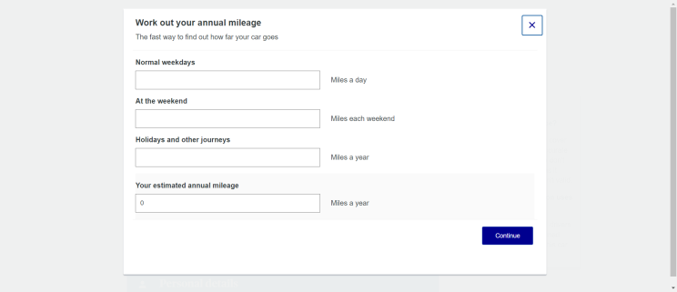
Many users don't know their annual mileage but will have a better idea of distances driven in a typical week. Well done Hastings for auto-calculating weekly distances, also AXA for their calculator tool (pictured below) although this is a tad prosaic.
Good in-journey support by Hastings, Elephant, Esure and Tesco as well as digital laggards NFUM. NFUM clearly up-weights the human support to deflect from their deficient online experience but credit where credit's due. Poor in-journey support by AXA and Aviva.
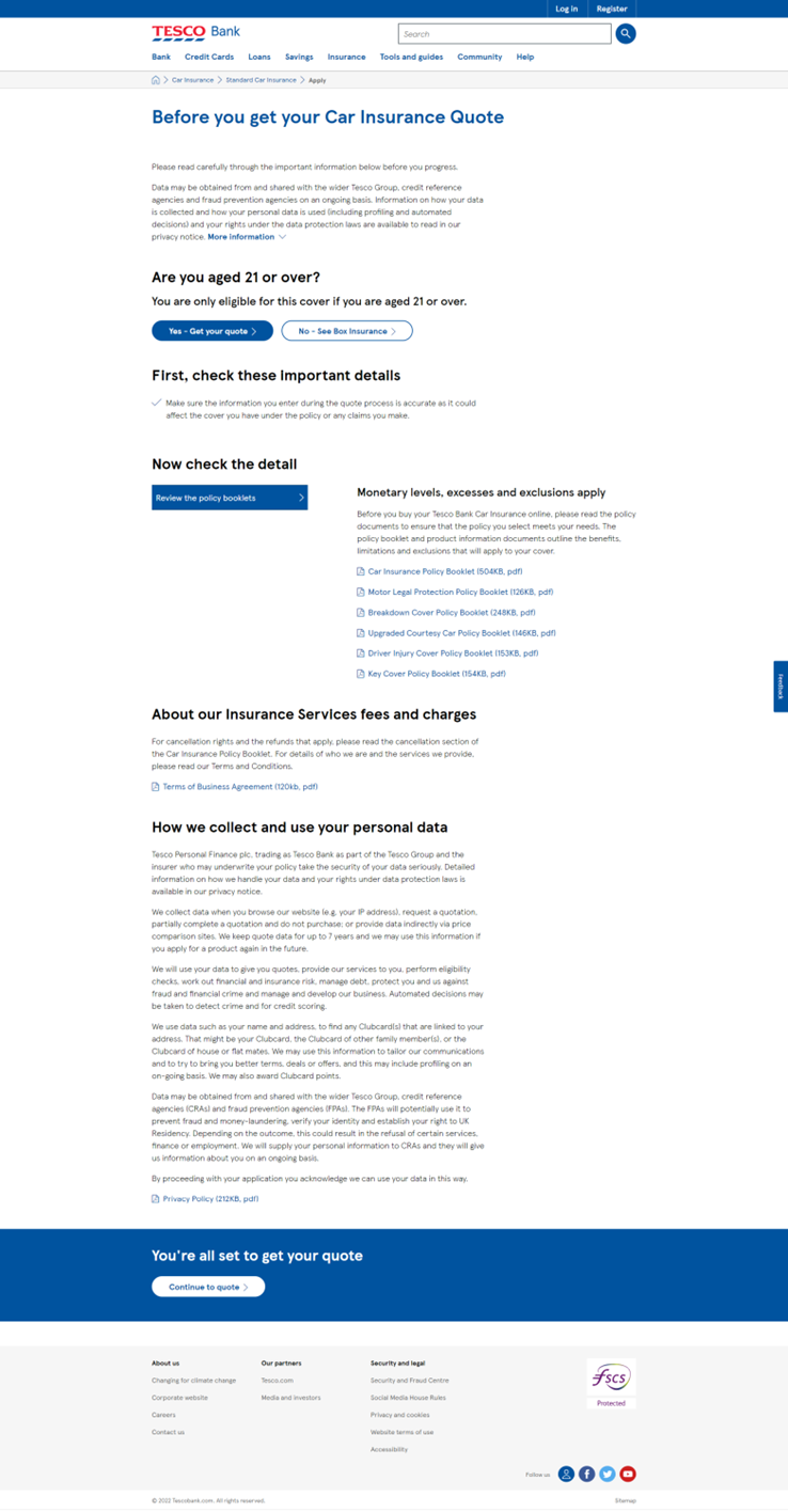
And with Consumer Duty coming in 2023, a shout out to Tesco for the care and attention they show at the start of their journey. Is this diligent approach the shape of things to come?
More digital insurance insights are available from DigitalBar and our UX insurance experts here at Pancentric Digital.
'Next Stop' campaign for Go-Insur highlights the advantages of e-trading for MGAs, and the ease of adoption.
Pancentric's Simon Fenn has been invited to judge the prestigious 2025 Insurance Times Awards. Read about his insights on Insurtech and Digital Transformation.
Leading HR network HR Dept has combined Pancentric's EnablerMail Solution with MS Dynamics to power a new lifecycle comms programme.