
Director Simon Fenn judging the 2025 Insurance Times Awards
Pancentric's Simon Fenn has been invited to judge the prestigious 2025 Insurance Times Awards. Read about his insights on Insurtech and Digital Transformation.


In Pancentric's latest analysis for insurance benchmarking service DigitalBar, we headline how Hastings Direct is leading the way on usability.

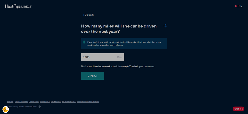
It's clear Hastings Direct has invested significantly in its quote & buy experience, scoring high across all of Pancentric's DigitalBar usability assessment categories.
Other car insurer brands are doing good things too, but Hastings leads the pack, on a par with the UK aggregators. Here's our round-up of what good looks like, Hastings style.
Refined, cohesive branding, a good balance between information density and negative space.

onsistent conventions, clear titles, pacey, simple presentation of options, chunky buttons, slick use of data to reduce effort.
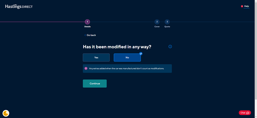

Hastings was the only insurer in our spot-check review to do this.

Users can quickly confirm assumptions (informed by 3rd party data) rather than answer more questions.
Natural, simple language, helpful touches and nudges
Distinctly
labelled, easy at-a-glance comparison of features.
Chat, phone, FAQs available throughout the quote & buy journey.
Pancentric's Simon Fenn has been invited to judge the prestigious 2025 Insurance Times Awards. Read about his insights on Insurtech and Digital Transformation.

Leading HR network HR Dept has combined Pancentric's EnablerMail Solution with MS Dynamics to power a new lifecycle comms programme.

Pancentric's Enabler solution has been the email platform of choice for Kidstart for 17+ years, now handling tens of millions of time-critical emails per annum